Scott Muckenthaler
Platform Redesigns
Style and direction for website shopping, browsing, learning, configuring, comparing and exploring.
Quick take
I like telling the story of products to people that want inspiration along with the information. Cars especially.
brand
Hyundai, Acura, Sony
date
2010-2022
challenge
Build and manage the identity for online shopping sites.
role
Creative Director
Selected platform building experience.
Hyundai
Acura
Sony
Hyundai
hyundaiusa.com
Hyundai is a dynamic automaker with aggressive goals. So to keep up we gave the shopping platform a clean, smart appearance and lots of solid content and put it on an aggressive schedule of enhancements and optimizations.
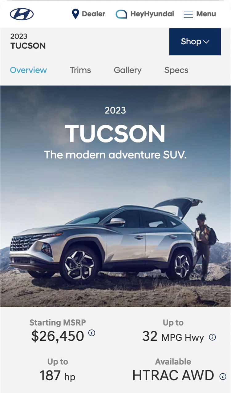
Homepage
One large promotional region was given a lot of layout flexibility for managing big product images, type orientations as well as layering logos and graphics. So a range of looks and stories could be supported while keeping the look clean.
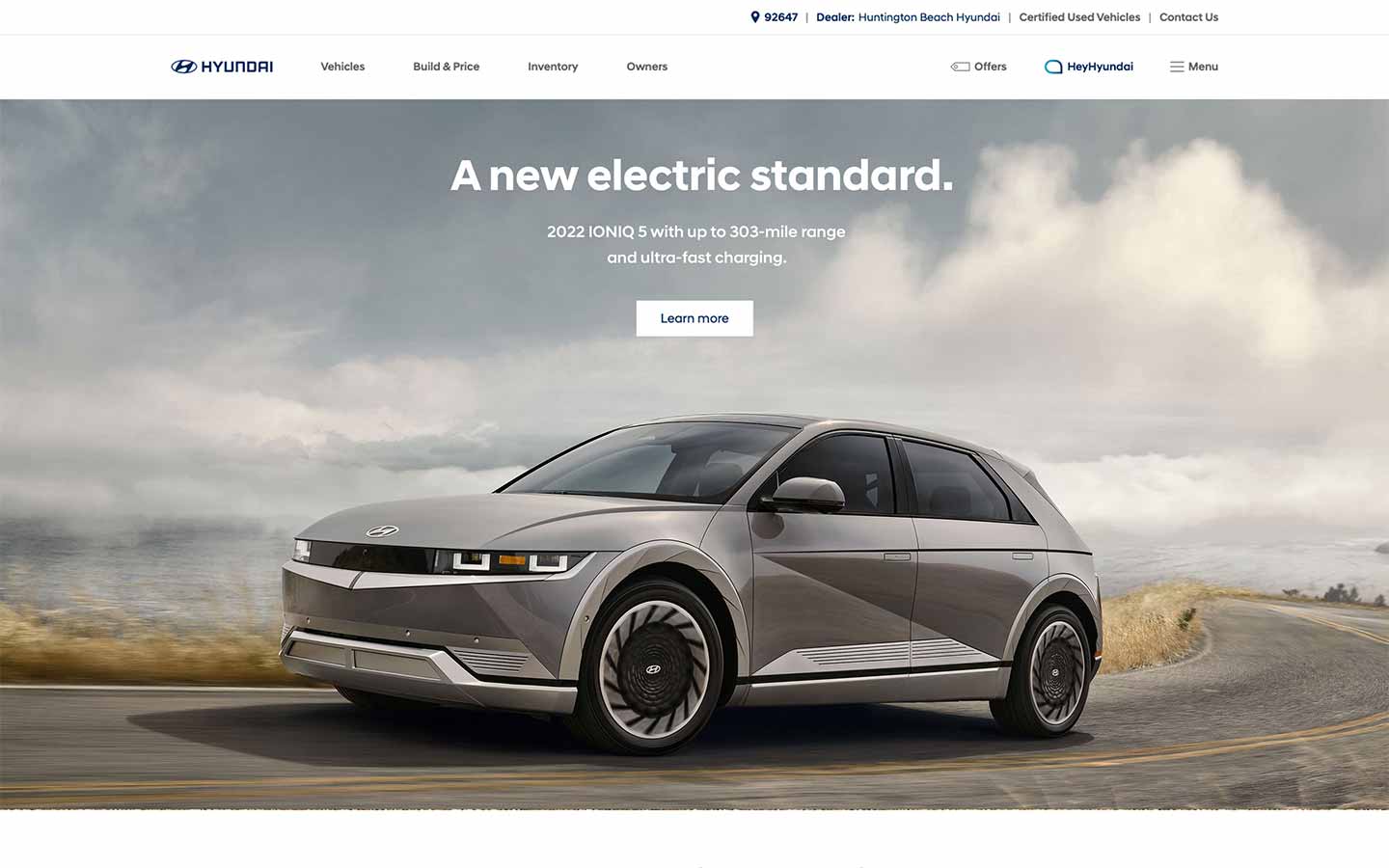
Homepage for Ioniq 5 launch.
Stacking two large promotional comntainers when two stories demand big homepage exposure.
Homepage responsiveness
Getting precision control over text and vehicle images for perfect presentation on every screen size.
Multiple image assets for six different break points. The image can be full-bleed while the crops can all be pixel perfect.

Multiple image crops in practice on the homepage.
Vehicle landing pages.
The story of a vehicle lives here. Its also where we have to find the right mix of detailed informaiton and visual exploring. Its also where the broadest range of component designs are found making these pages our biggest balancing act.

Landing page for Ioniq 5 launch.

Tucson landing page content.

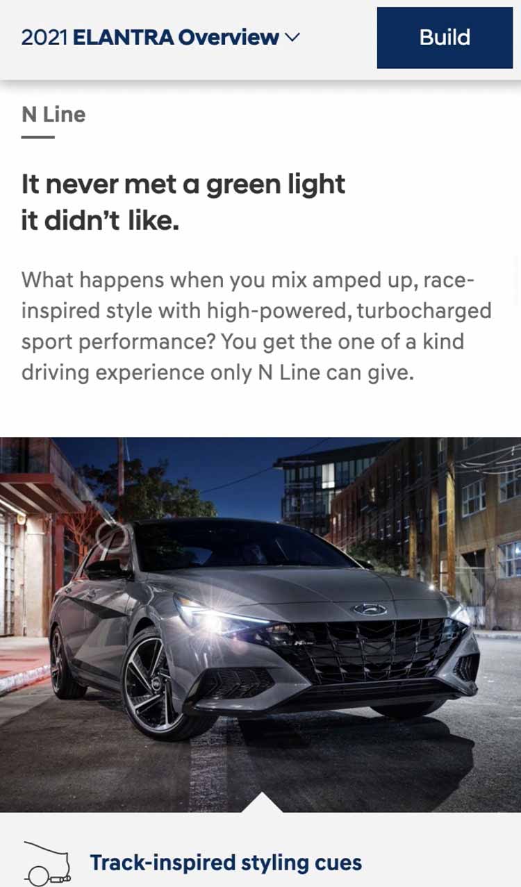
Trim level focus and feature detail.

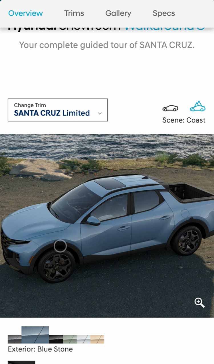
3D visualizer for Santa Cruz launch.

Tucson landing page content.

Landing page content from several vehicles.
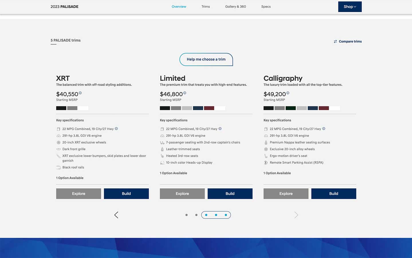
Pricing details.
Our most critical area of product information – the prices of the trims. Then its what you get at that price, packed into as small an area as possible while allowing some side-by-side comparison.
Mostly facts. But a key addition is the summary statements under each trim name. These put it all into human terms, as if someone was talking to you. For Limited trim it's "The premium trim that treats you with high end features." while the middle SEL trim is "The balanced trim with plenty of must-have features."
Feature details and information.
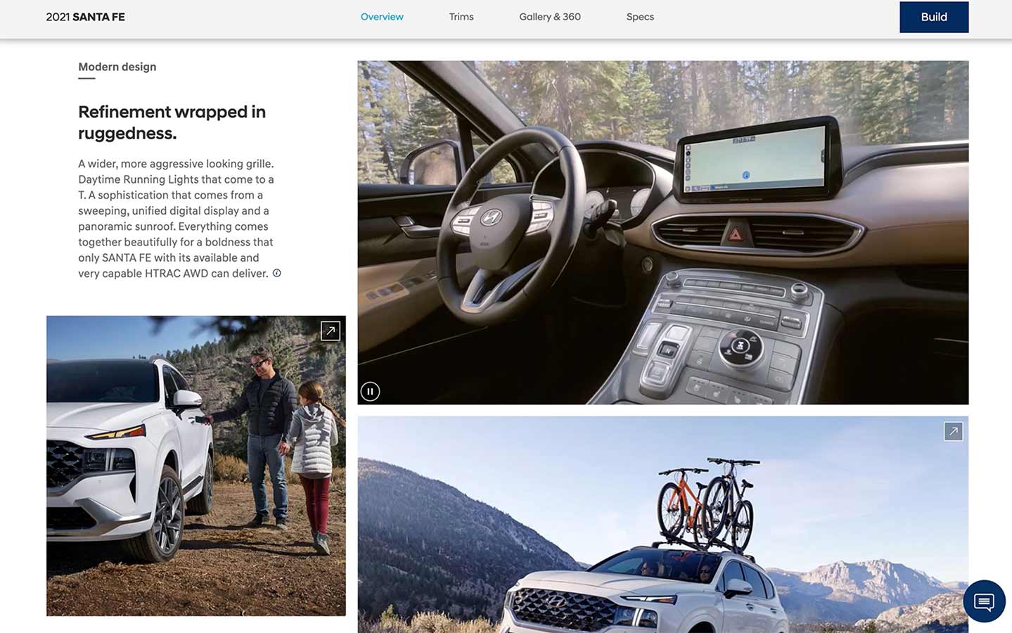
The imagery and story come together in an array of component layouts. We put unique arrangements in place to let the different identities of the products come across with the details and benefit info.
Build & Price.
Where the dreaming is done.
While Hyundai models don't have that many customization choices, build and price is still a great way to shop. It's still where someone will see all thier options and see things come together in a step-by-step experience.

Build & Price sequences and flow.


Build & Price summary for Tucson.
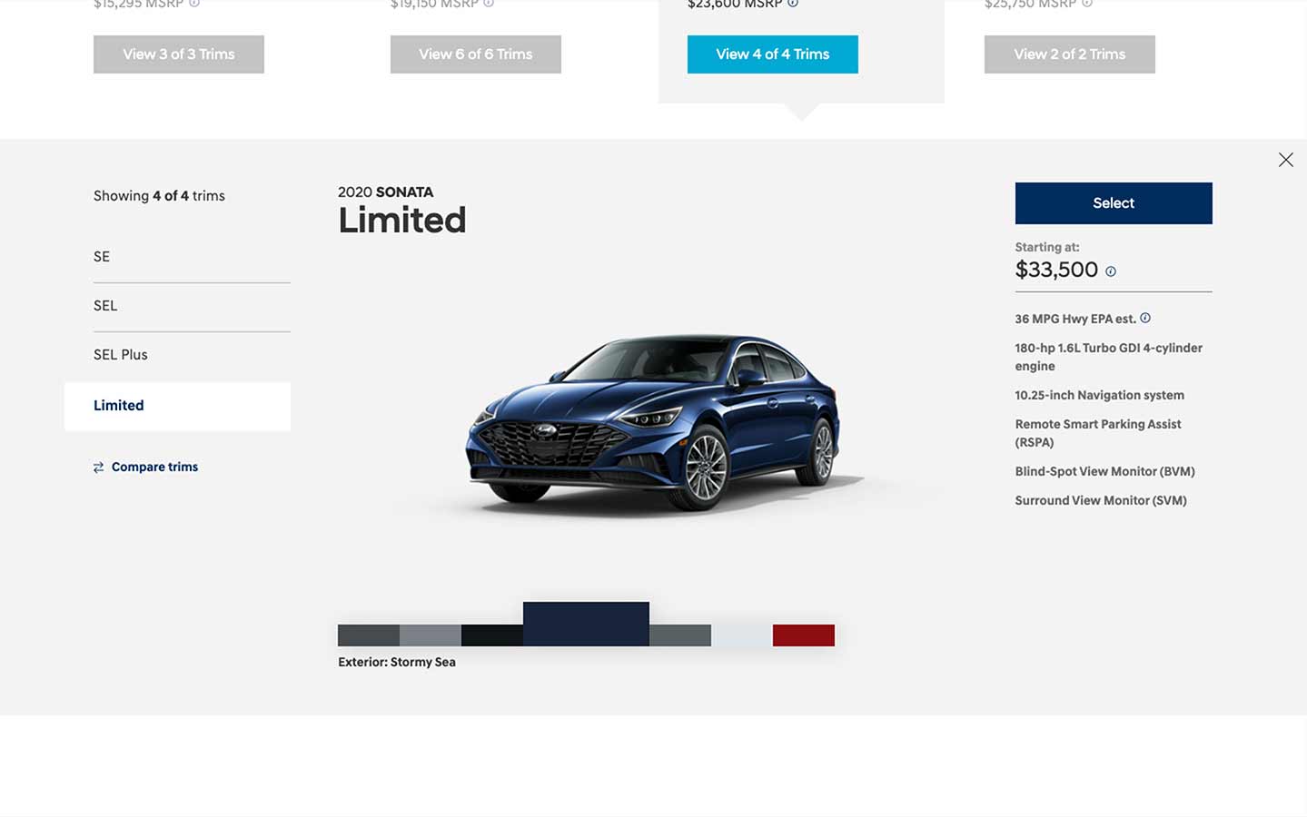
Trim selection step for Sonata.
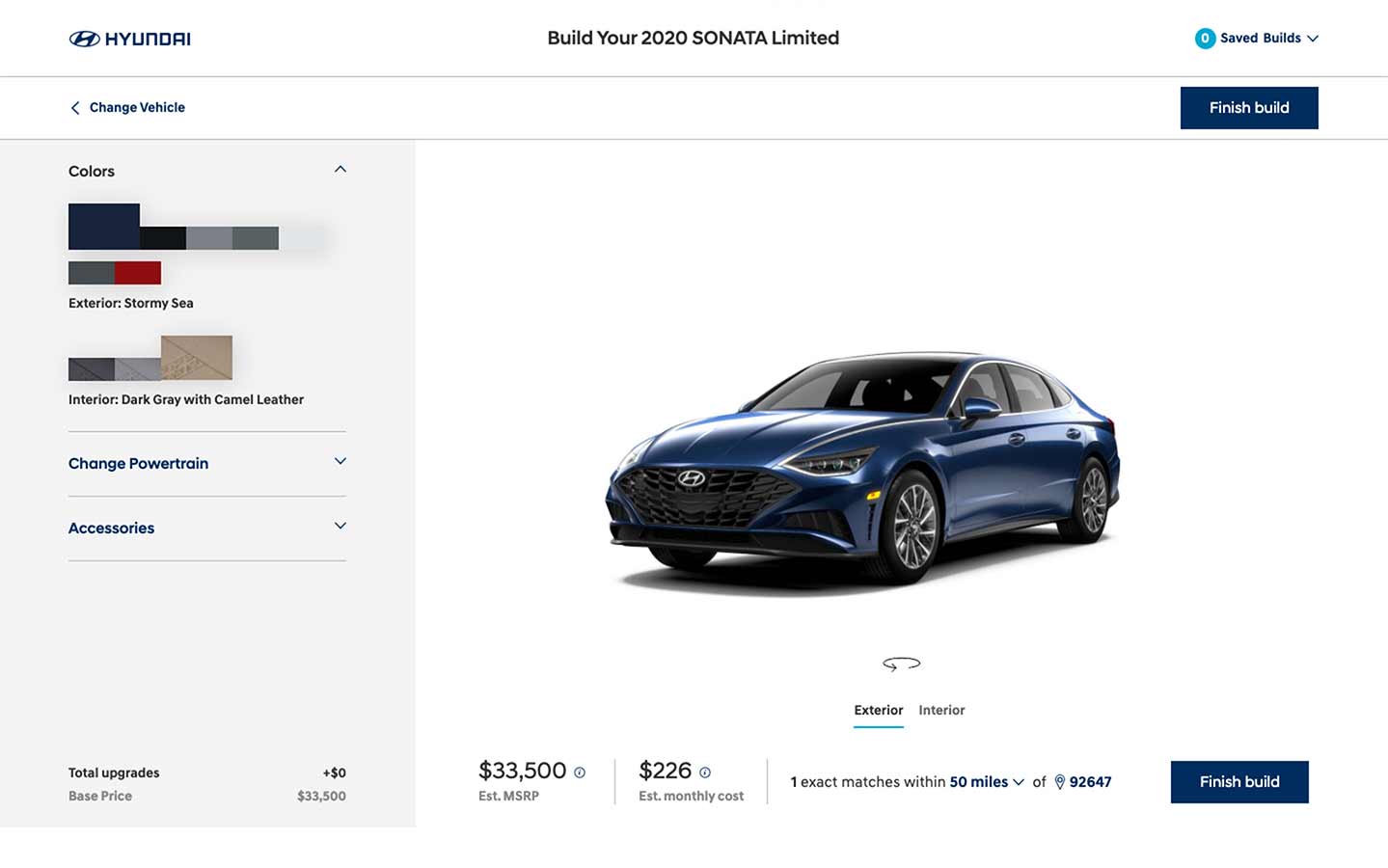
Colors and options step for Sonata.
A major Build & Price enhacement made the experience far more visual. The new UI allowed the information to became far more consumable with a more selectable appearance.
The information details remained from the earlier version, but all the choices and the vehicles got bigger. We wanted the builder to feel more like play, and less like research.

Sequences for the Build & Price upgrade.

Sequences for the Build & Price upgrade.
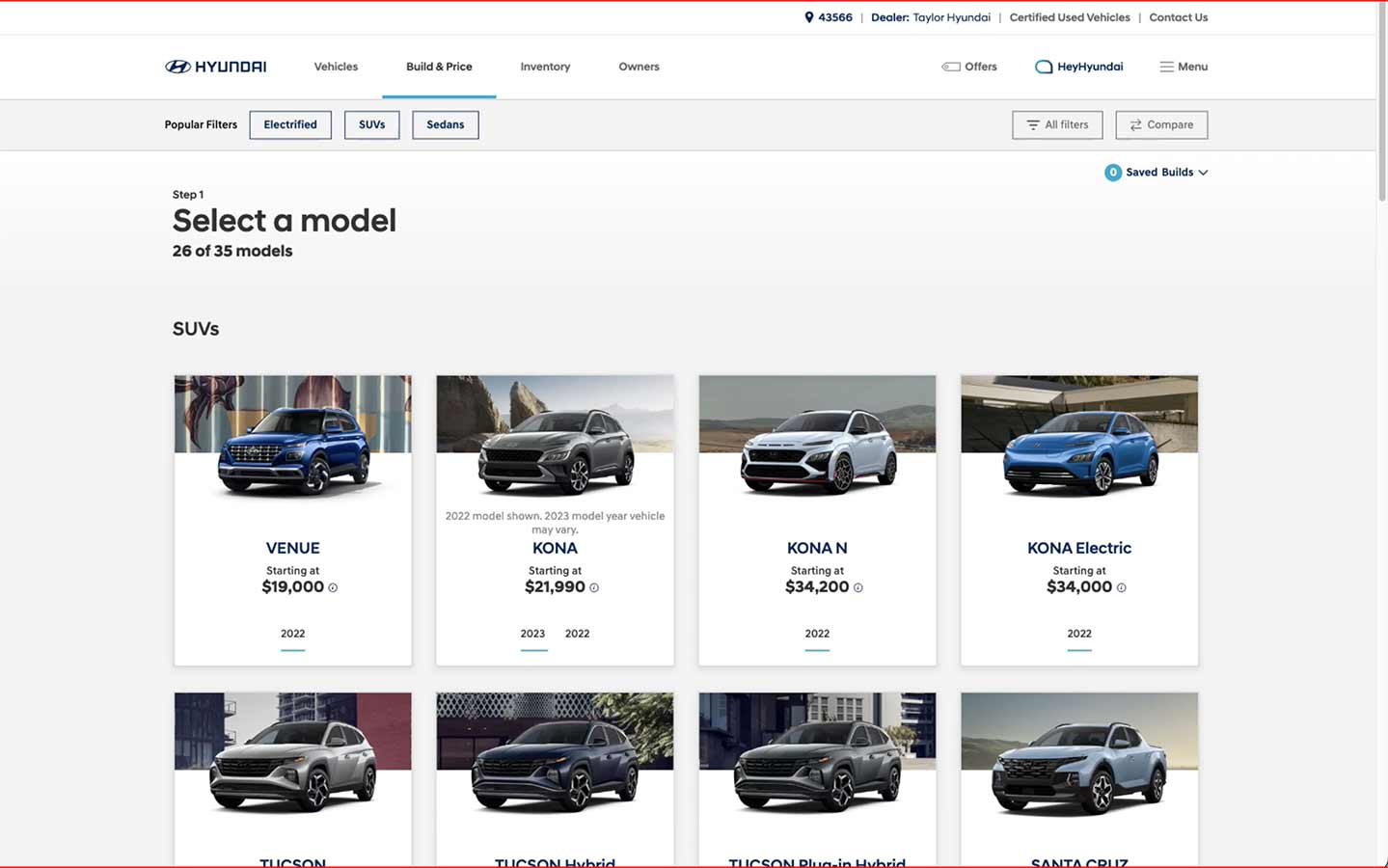
Model selection.
We combined the CG image of each car with a photographic backdrop from it's respective image gallery. That allowed each car to capture its own personality while using the consistent view across all vehicles.

Trim selection.
The view of the vehicle and its backdrop continue from step 1. Then a simple card stack presents the trim options and prices with a parallax scroll when the number of trim options goes longer than the screen height.


Customization.
Exterior colors, interior colors and package choices each take a full bleed appearance to make these choices as immersive as possible.


Gallery, Category landing pages, Inventory search, Offers and other sections that complete the expereience.
Modern car shopping means hunting for all kinds of product information in a multi-faceted process. We grew our platform to meet people in these places with consistency and clarity.

Photo gallery sequence for multiple models.


Introduction for the perfromance vehicles category landing page.


Trim level selection step of Inventory Search.

Special offers section.

Sequence of category landing pages.

Photo gallery sequence for multiple models.
Acura
acura.com
This redesign was defined by its dark theme, left navigation, site speed and the introduction of in-line video on product pages.

Seequence of screens for the Acura wibsite redesign.
Sony
sony.com
This is a proposal for a global redesign. The intent was to marry Sony's entertainment properties with the products store for a more compelling brand presence in the websites aroud the world.

Sequnce of screens for the proposal for Sony's global site template redesign.